
Woodward Academy
Capturing an Academy's spirit
Woodward Academy is an independent pre-K through 12th grade college-prep school with more than 2,400 students in south Atlanta.
The school’s identity experienced a metamorphosis over the decades. Founded in 1900, the Academy was originally an all-male military school. Later, it became Atlanta’s first private school to integrate and enroll Black students.
Today, they foster an inclusive culture, and their community is made up of students from all races, religions, backgrounds, and learning styles. Woodward is dedicated to helping their students find themselves, grow as leaders, and become good people. And when their editorial team met with me, they needed help bringing that modern-day identity to life.

Photos by Kaylinn Gilstrap / Illustration by Mike Lowery


CHALLENGES AND OPPORTUNITIES
Woodward Academy publishes a semiannual magazine sent to the school’s current students’ families, prospective students’ families, and network of more than 10,000 alumni.
Woodward magazine was in desperate need of an overhaul. It lacked cohesive branding, a consistent format or layout, and a clear purpose. The publication was a mish-mash of content, style, and messaging—none of which told a story.
The magazine needed to be an embodiment of the “Woodward Way” of respecting one another and the world, as well as finding ways to make a positive impact within the greater communities they serve. The existing content didn’t speak to this.
And ultimately, it needed to become a high-quality piece of content marketing that reinforced the school’s culture and identity and elicited donations from alums. This magazine relaunch was the first piece of what would eventually become a larger brand shift around the “Woodward Way,” so it had a lot of heavy lifting to do!
BEFORE
AFTER
THE PROCESS
Woodward’s editorial team and I agreed it was time to start this magazine from scratch. So we looked closely at everything that wasn’t serving a larger purpose and, well, threw it out the window.
Then we dove into my process for rebranding and relaunching a magazine:


The inspiration and gathering phase.
This is where we identified other publications that ignited a spark of inspiration—and not just other schools’ publications, but the types of magazines a Woodward alum might subscribe to.
During this highly collaborative process, we also reimagined the content lineup, types of sections to include, and the number of features to highlight, all while keeping in mind our larger goals of educating, informing, and engaging our audience.

The foundational stage.
This was the part where we really got our hands dirty. We had to come up with the perfect look and feel for Woodward mag, so we created multiple cover mockup options—all with different nameplates, color schemes, images, and fonts—to really zero in on the right direction. We experimented with different vibes to find what felt most true to the establishment and where they were headed.
Ultimately, Woodward magazine needed to feel like a well established publication that has kept up with the times. (Kind of like a craftsman home that has solid bones and classic architecture, with modern furnishings and tasteful updates.)
The cover mockup we chose perfectly embodied that, so we used that cover to build out the rest of the foundational stage elements, like the typography, color palette, and grid for the rest of the publication.
The mockup and buildout stage.
Our next step was to build out a proof of concept to confirm we were headed in the right direction. (They were loving it!) From there, we built out an entire prototype (which helped us nail down the word counts), created an imposition, and built out InDesign templates to streamline future issues.
All the while, the next issue was due to come out soon, so we used actual content during the buildout stage. Not only were we rebranding, but we were executing conceptual ideas of the stories we wanted to tell, hiring photographers and illustrators, directing on-site photoshoots, creating visuals, and coordinating it all with the marketing and communications team.
It was a ton of work made more challenging by the pandemic, which restricted the types of shoots and collaborations that were possible. But that also forced us to get even more creative, and the results made it all worthwhile.


“When we set out to redesign Woodward Academy's magazine, we needed to take a stodgy, boring publication and breathe new life into it. But we didn't have a lot to go on aside from a desire to take the energy and vitality of the school and represent it on the page. Heather took that simple start and developed a beautiful, fun and truly unique magazine, one that perfectly captures the Academy's spirit.”
— Van Jensen, Editorial & Creative Manager, Woodward Academy
THE RESULTS
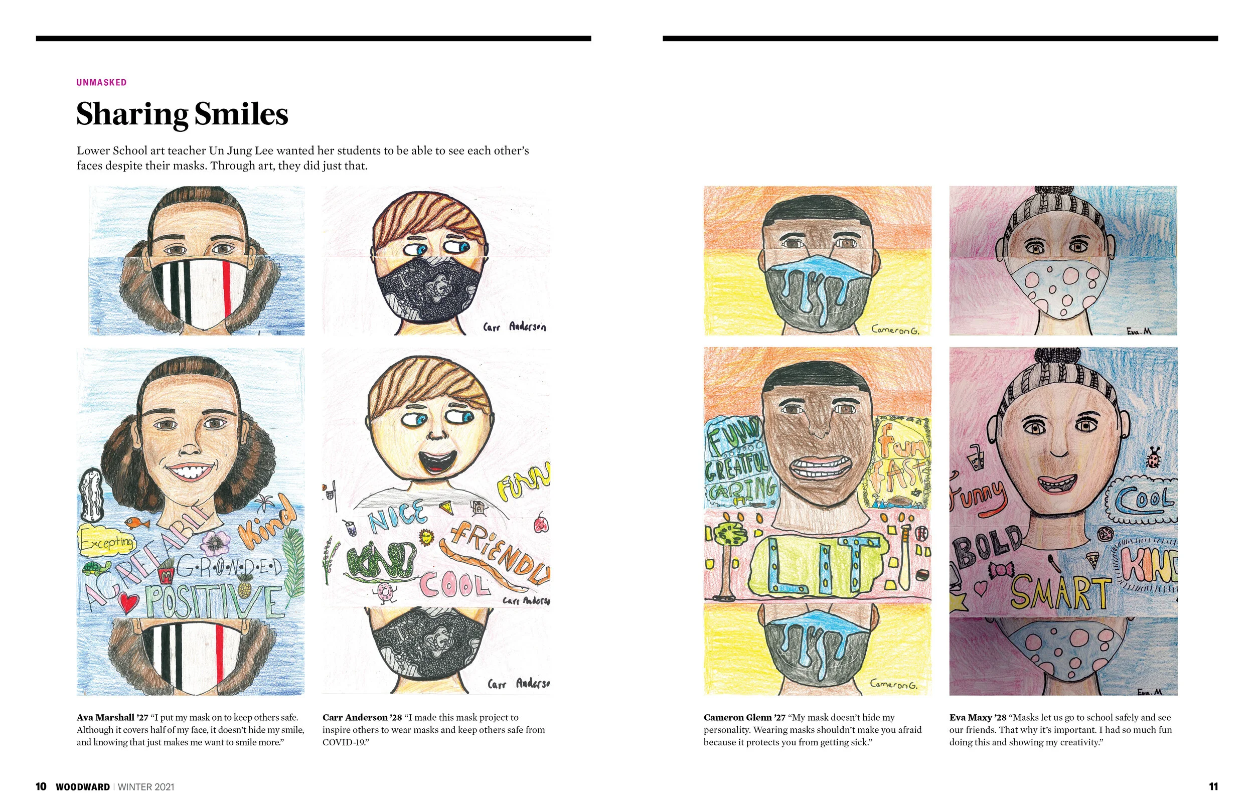
The first issue of the relaunched and rebranded Woodward magazine was published in early 2021 during a time of uncertainty in the country and around the world. It was fitting that the issue depicted students’ experiences and artwork that told stories about their time during the pandemic.
The new magazine also featured an expanded alumni section highlighting the successes of alums, which not only included them but also showcased their accomplishments to demonstrate to prospective Woodward parents what alums achieve beyond Woodward. It also spotlighted the academy’s amazing offerings like the film and robotics programs—and how the students were thriving in them.
Overall, we elevated the look and feel of the magazine, as well as the quality of the content. We put systems in place to create a consistent experience for the editorial team as well as the readership—and people noticed.

Black at Woodward
We also issued a special edition of the magazine titled “Black at Woodward,” in which the school’s Black alumni, students, faculty, and parents contributed their stories and experiences of dealing with racism at the school and in their community. The publication won a CASE award for starting a dialogue in their community, empowering Black voices in the process, and openly addressing institutional failures.
SERVICES
Publication launch, editorial branding + design, art direction